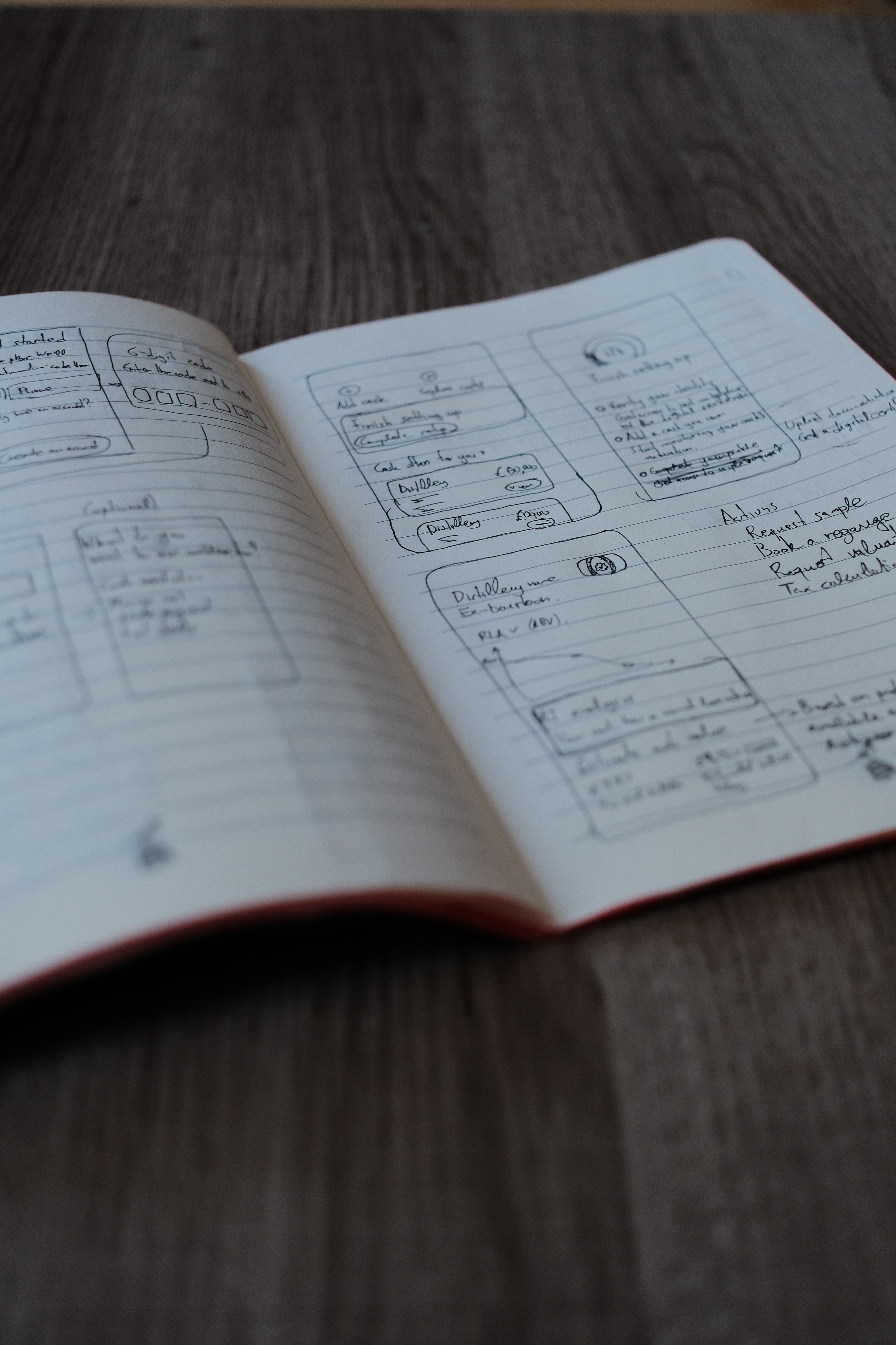
Dramfly: building a memory for whisky enthusiasts
I co-founded and designed Dramfly, a whisky tasting app, from an idea validated at Scottish whisky festivals to a live product on iOS and Android.

I once tasted a whisky at a festival that I really loved. A friend asked me about it a few weeks later and I couldn't tell him the name, the distillery, or what it actually tasted like. It was just gone.
That's happened to me more times than I'd like to admit. My co-founder and I met about a decade ago in Edinburgh, working at the same tech startup. We shared an interest in whisky and spent the years since going to festivals and distilleries across Scotland, tasting things we should probably remember more clearly than we do. Just before last Christmas, we finally said it out loud to each other, and decided to do something about it.
Before we built anything
In the beginning I used Claude to research where whisky enthusiasts already talk about tastings. Facebook groups, Reddit threads, whisky review sites, forums. We wanted to see how people were already handling this problem, or whether they were handling it at all.
Tasting notes were scattered across Instagram posts, private Facebook groups, Twitter threads, phone notes apps, paper notebooks carried to events. All of it was getting lost. A social media feed move on and the camera rolls fill up. A photo of a bottle from three years ago tells you nothing about what it tasted like. The behaviour we needed was already there but the tools for it were just inconvenient.
That gave me a clear hypothesis: build something fast enough to log a dram in the moment, in any environment, including a crowded festival venue with no signal, and enthusiasts would use it to build a permanent record they could actually return to.
Designing for a few seconds, glass in hand
We set ourselves a target of a working Alpha in one month, building part time alongside our day jobs. That constraint shaped the design as much as any research did there was no room to build something people would only use occasionally. The MVP had one job: be the fastest possible way to log a dram, anywhere.
The real design problem was getting someone to log a dram in a few seconds while they're standing at a festival stall or a bar, glass in hand, surrounded by people.
The flow also had to work in three different contexts: a big organised event, a small pub or bar with its own "join" step, and what we call a "solo pour", just you and the dram without any location needed. I designed one flow that adapts to all three scenarios.
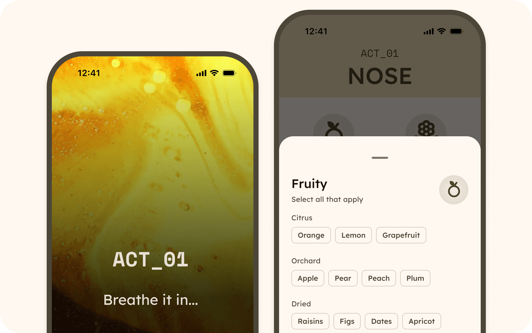
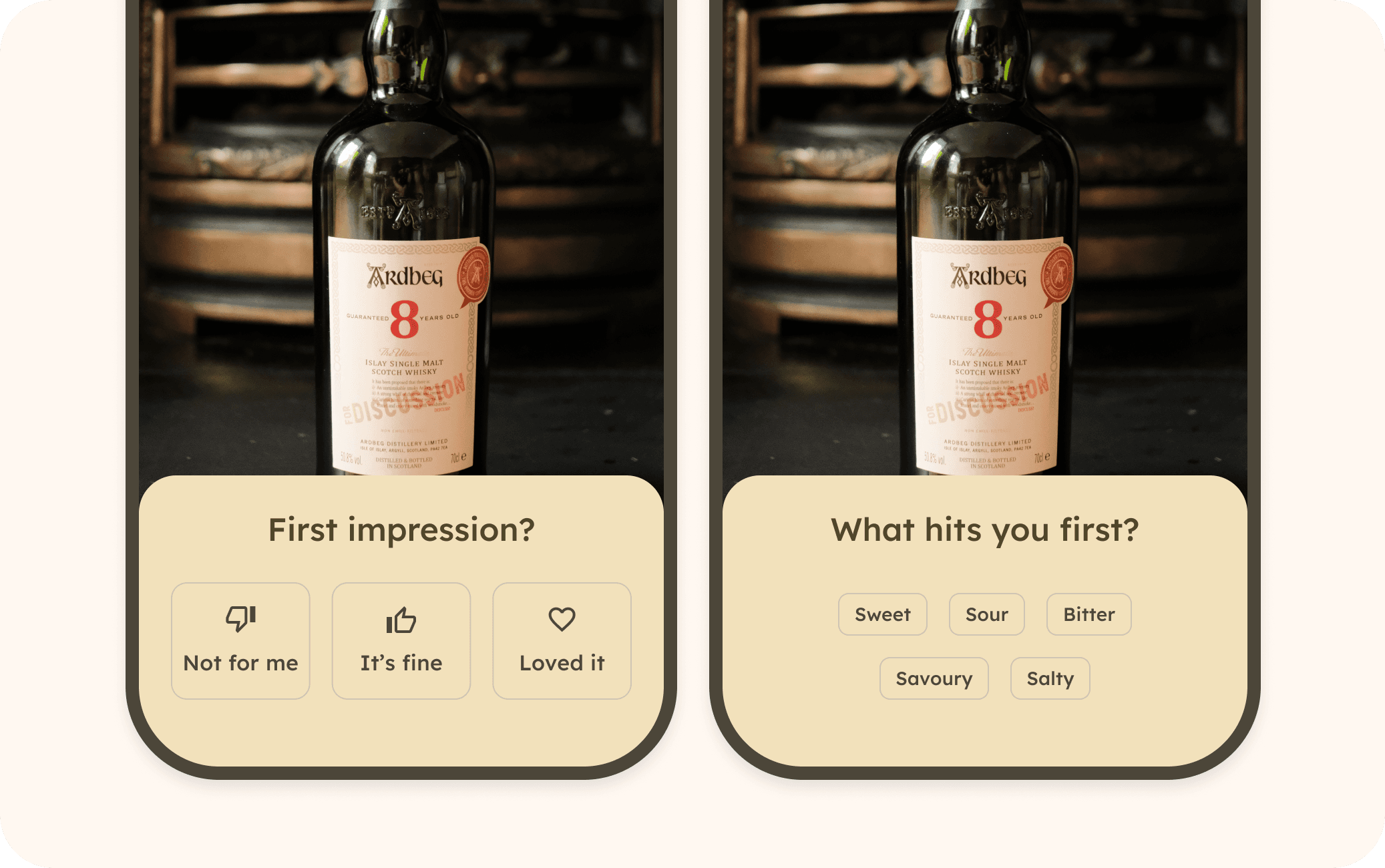
I also had to design for recognition rather than recall. Ask someone to write proper tasting notes and most people freeze, because they don't have the vocabulary for it. So I split the flow into a fast first read, a quick "loved it / it's fine / not for me," then "what hits you first" (sweet, sour, bitter, salty, savoury) before asking anything more detailed. The deeper flavour notes, grouped as Nose, Palate and Finish, come after that, structured around a proper flavour wheel: eight top-level categories like Fruity, Peaty and Woody, each opening into specific notes like citrus, orchard fruit, dried fruit, berry. Every one of those screens has a "save for now" option, because a half-finished log beats no log at all.
One decision I'm genuinely proud of:
At events, people don't taste one dram, they taste five or six in a row. So I built the flow around a session instead of treating every tasting as a one-off.
Photo first
I wanted logging a dram to feel like part of the ritual. The flow opens with a full-screen photo of the bottle, taken through a camera and that photo stays as the backdrop behind almost every screen that follows. Moving between Nose, Palate and Finish, each act opens with a short, full-screen transition. "ACT_01, Breathe it in…", "ACT_02, Take a sip…", small moments that slow the pace down and mirror how an actual tasting works.
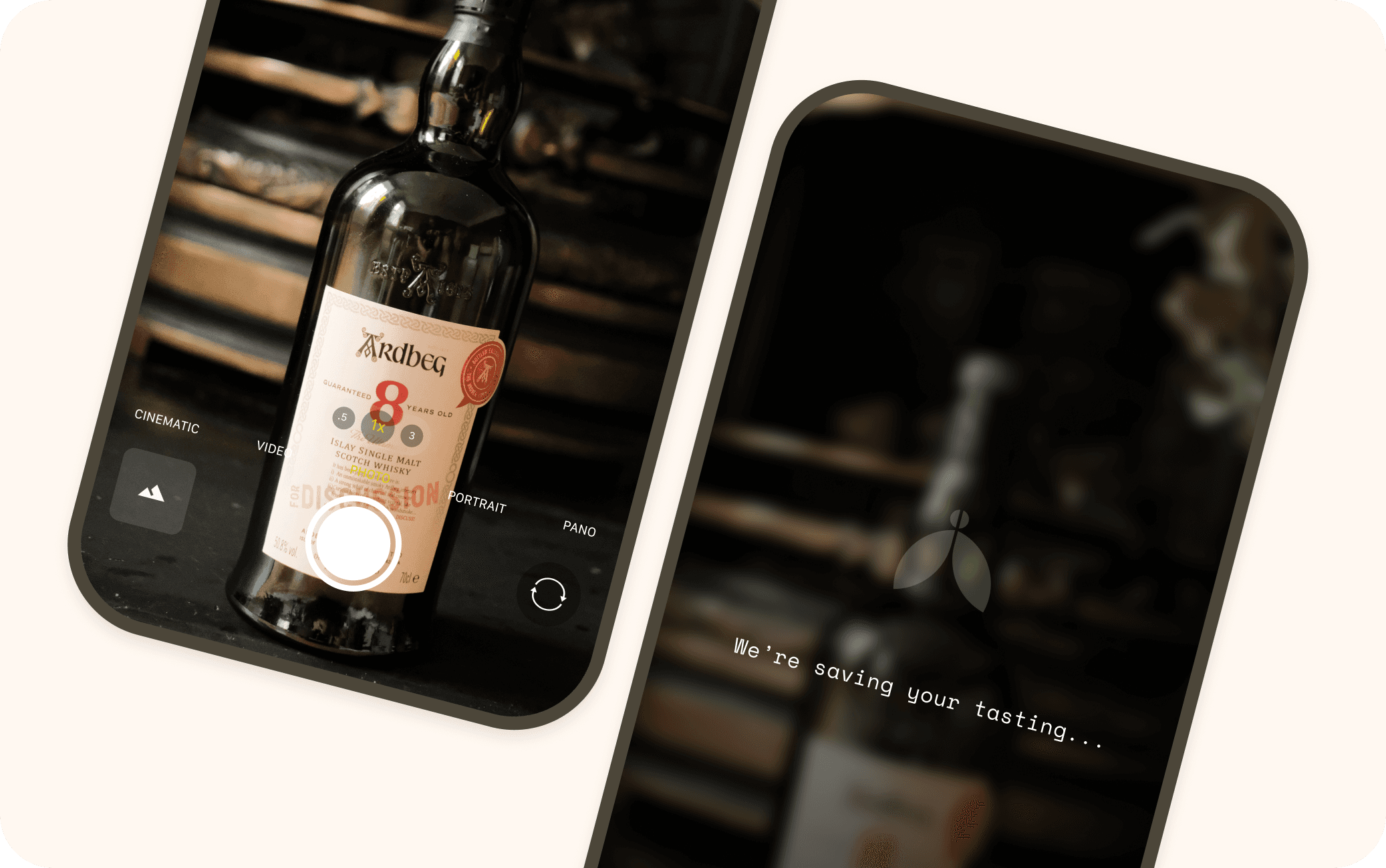
The small details mattered a lot here. A retake option on every photo, a save state that shows our own logo instead of a generic spinner, chip selections that fill in and show a count as you tag more notes. None of it is complicated on its own.
Building the audience alongside the app
I used AI tools from the start to move fast on a two-person, part-time team. I used Claude to define the Dramfly brand, then Figma Make and Claude together to brainstorm and narrow down the MVP feature set. This work would normally take several weeks compressed into hours. We hit our Alpha target and released the app in April.
While I designed the app and my co-founder worked on the technical architecture, I ran Dramfly's Instagram as a lightweight validation tool, A/B testing posts and stories against real whisky enthusiasts before the app existed. It reached 500 followers in two months. I also built dramfly.com in Framer to collect early interest, and the waitlist hit 50 signups within a few weeks, a real signal that the problem reached further than the two of us.
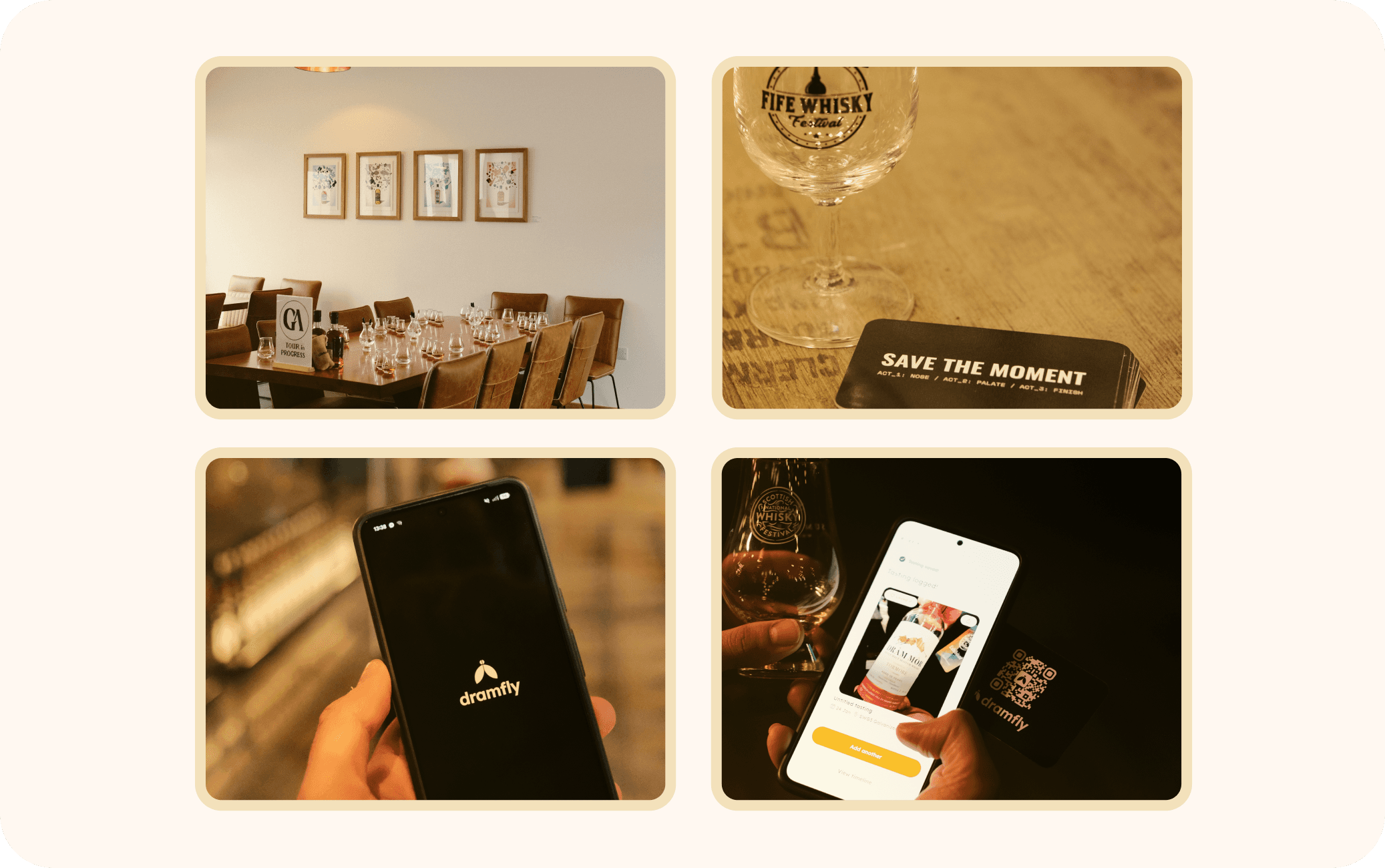
We sponsored a whisky festival in Scotland to field test the app with real people: twenty people came to our booth, tried it, and gave us honest reactions. That guerrilla test was low cost and I gathered valuable early feedback. It confirmed the logging flow held up in the exact conditions it was designed for: noisy, crowded, unreliable signal.
What the numbers said
Dramfly is now live on iOS and Android. Three months into that launch, our analytics shows the flow working the way I designed it to: of the people who opened the in-app camera to start logging a dram, 61% went all the way through the three-act flow (Nose, Palate, Finish) to a saved tasting. We picked up active users in 16 countries, and the concentration backs up the original hypothesis. 61% of active users are in the UK which is the festival and events network we built the go-to-market around, with no paid marketing behind any of it.
Although, the data also told me that the retention past the first week is weak. Most weekly cohorts show only a few people coming back the week after they first used the app. People will complete a tasting once they start one. Getting them to open the app again a week later is the problem I'm solving now.
What I'd change
I had to design the first version fast, so we could get it in front of real users quickly and keep the gap between design and development as short as possible. I built a new process around Claude Code and the Figma MCP server to make that possible.
If I did it again, I'd build the design system components first, before touching any actual screens. I designed the screens first and built the component library after a couple of weeks, once the gaps became obvious. Once I had proper reusable components, Claude Code could build the UI directly off them, and design-to-development time got roughly 50% faster, with cleaner code as a result. That's the one thing I'd change: start with the foundations first and then design each user journey.
What's next
The retention data pointed to a clear next step. People had a reason to open Dramfly the moment they were tasting something, but no reason to open it in between. So I'm currently designing a discovery experience where enthusiasts can explore and join whisky clubs, and get notified about tasting events happening near them.
The idea is to give people a reason to open Dramfly before they attend an event, to see what's on near them or what their club is tasting this month. Logging a dram stops being the only reason to open the app. It becomes something you do while you're already in there for another reason.

I've also become more comfortable with Claude Code since building the first version, so I'm doing some of that build myself: writing code, submitting pull requests on GitHub, and having my co-founder review them. Regardless of whether a PR gets merged, each one teaches me something about how the engineering side works, how decisions get made, and the code that actually runs the app. That makes me more aware of what's feasible, and it feeds back directly into how I design.